
Ferrovial has turned 66 . What started out as a family business for railway construction has grown and transformed into an association of brands that is recognized worldwide in sectors as varied as construction, services, airports, and highways, to name a few. All of this variety and business verticals fall under the same umbrella.
![]()
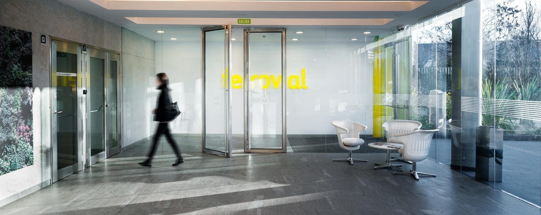
The above logo, created in 2009 , represents around 100,000 workers all over the world. Logos evolve along with brands, even though we sometimes pay little attention to the work that goes into them. This is our experience of the brand, and part of the history of Ferrovial’s current image.
When does a brand need to change its logo?
Logos are not static, nor is the brand’s approach to clients or the general public. In recent decades, technology has allowed us – as this article shows – to get in touch directly not only with those who hire us, as may be the case with hospital management in the maintenance field, but also with the service’s end user.
There always comes a time when every brand needs to reinvent itself and rediscover its own identity, just like all of us do at certain times in our lives. Often, this is because of the societal advances that surround us. When you are such a diverse brand with decades behind you and dozens of different logos (one of them below) coming into the 21st century, you think about catching up with the times.
![]()
These ideas were in the air when Ferrovial contacted SUMMA Branding several years ago, the agency that worked on redesigning projects like RTVE or Red.es. The challenge of updating the logo and the brand’s image showed up on our doorstep one day with a more or less clear-cut proposal. This point is key. When it comes to designing a company logo, it is key to know what the company seeks to convey. Or at least that it is seeking to convey something different.
What is taken into account in designing a logo?
Ferrovial had seen the need to unify a brand that contained dozens of companies under the same logo, and that specializing the logo for any one of the fields (services, airports…) would leave the rest of the logos in its shadow. In other words, a pictogram or isotype – the Burger King hamburger or the Twitter bird – was out of the picture.
Given everything that didn’t seem to work, it was one of the first requests that we encountered from who was previously my client – I used to work at SUMMA Branding – and who is now the brand that I work for. Concepts as abstract as “intelligence adapted to services,” “transparency,” “cleanliness,” are common in the first rounds.
Luckily, there was a key element that stood out for its concreteness: the color yellow. Ferrovial has always identified with this color – even though it would later change the hue – and sought to keep it. As you can see in the blog’s heading, the brand’s announcements, and even the color of the links, yellow is a fundamental part of the brand.
To condense all of these concepts into something more tangible, the first thing that the branding company, in this case, needs is to study its business model, the brand’s culture, what values they hold, etc. From here, the strategy team that carries out the study takes the lead, even though the client (Ferrovial) is involved in the work for obvious reasons.
Their help is indispensable. As part of the strategy team, it is necessary to delve into this research not only to understand what the brand is about, but also what impact it has on society or what it sees for itself in the future.
Ferrovial wanted to grow young again, distancing themselves from the hard image of cement, and to include the fact that they were committed to much more than installing railways or building bridges in their logo. With such an abstract, theoretical picture, we set about creating a new identity that collected all that we are now.
The company culture continues to evolve
Company culture is a curious notion. Today, with a completely standardized logo, we sometimes find slight modifications. Someone thinks that the word “ferrovial” looks better against a green background, and suddenly you find several logos that are almost identical to the old one, but in other hues.
Other times, it only appears as an isotype when placed alongside a collaborating brand, or even disguised with the colors of the flags of countries where we have projects. Studying these derivations is very interesting, and it shows that, even though we are just one brand, work teams have particular identities, cultures that are shown in certain countries, and of course, the desire the create a company, even if it is through its logo.
And this happens even now that we have a logo and a set font. How could it not, when business fields were using their own iconography? Ferrovial had commissioned a new image from us. A new brand was about to be born on our work table, and we “only” had to select a font.
Why is one font picked over another?
Most people go about their lives completely unaware of the amount of work that goes into picking a font. Or, in our case, designing it. There was a moment when we had thousands of different designs at our fingertips. None of them worked to represent a group like Ferrovial, and there were virtually no differences between many of them.
Rounding at 21° instead of 21.5° at the edges of one letter, increasing the thickness of another by one point, selecting how many points each vowel should be… We knew that we were looking for a friendly design, round, lowercase letters with basic fundamentals and principles. That is not uncommon since almost all brands use lowercase letters in their logos.
Without the invaluable help of Andreu Balius, who designed the typography, the project would have been impossible. Today, the final result fits the group’s many business models like a glove, and Kike Valdenebro – a collaborator on Ferrovial’s website for years – has his own theory about the chosen typeface.
As it is said, the uppercase letters in the chosen font, a rounded sans serif, are very similar to the uppercase letters that were handwritten on technical drawings. On the other hand, the lowercase letters are directly related to the services world. It is a nice way of seeing it, in hindsight. The pieces always fit together once you finish the puzzle.
Building a brand’s image on white space, knowing only some of the contours, is considerably more complex. We had yellow to work with, and white soon entered the picture as a friendlier center. Today, we continue to use this pairing even in our photos, preferably with natural lighting.


There are no comments yet