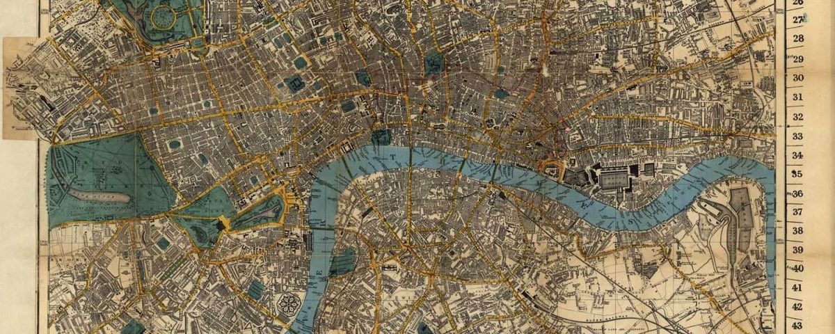

In the mid-19th century, London was a booming city, the most populous in the world. The capital of a powerful empire. Its port moved more goods and passengers than any other, and its financial institutions ruled the planet. The city’s underground was preparing for the construction of the first subway, and Big Ben (or the clock tower, as it was officially known until 2012) was beginning to rise over the banks of the Thames.
And even so, the city couldn’t stop 10% of Soho’s population from succumbing to one of the worst cholera outbreaks recorded in London in just one week during August 1854. Almost 18,000 people then lived in this part of the City of Westminster, and the British capital was nearing three million inhabitants. Cholera struck again, leaving nearly 2,000 dead in seven days. The epidemic spread through the city, leaving around 10,000 dead.
The disease would change the course of Soho, then the most densely populated area of London, forever. But the outbreak would also be followed closely by John Snow. His map on how the disease spread in 1854 led him to become the father of modern epidemiology. The data on cholera helped us change the way we understand epidemics and disease.
The stench of disease
Cholera is an intestinal disease caused by eating food or water contaminated by bacteria: Vibrio cholerae. According to the World Health Organization (WHO), up to four million people get the disease each year, resulting in up to 150,000 deaths. In the 19th century, however, it was quite a different situation.
From 1800 to 1900, the disease “spread across the world from its original reservoir in the Ganges delta in India. Six subsequent pandemics killed millions of people across all continents,” the WHO reports. This is all well-known today, as well as how outbreaks of Vibrio cholerae and the serogroups responsible for epidemics work. But in 1850, it was thought that diseases were caused by bad odors.
Miasma theory, which prevailed during the seventeenth, eighteenth, and nineteenth centuries, claimed that it was the set of putrid emanations from contaminated soils and waters that caused the disease. The fermentation of different elements and, in particular, blood, produced toxic gases that caused outbreaks of cholera, smallpox, and syphilis, as well as other diseases. That was the only way to explain why epidemics were common in poor, heavily-populated, dirty, smelly neighborhoods.
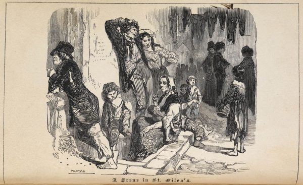 **Scene in the slums of St Giles in London, 1852. | Wikimedia Commons/Thomas Beames
John Snow was skeptical. He had lived through one cholera outbreak as a medical practitioner at just 19 years old, and to him, it didn’t seem like miasma theory explained disease behavior very well. This was still years before Robert Koch and Louis Pasteur would lay the foundations of the germ theory of disease. Then, miasma theory would be put away and forgotten, and science would set out to identify bacteria and, once well into the 20th century, viruses.
But let’s get back to London and overrun Soho. In an essay published in 1849, ‘On the Mode of Communication of Cholera,’John Snow made his doubts about miasma public. He didn’t have an answer, but he believed that the disease was contracted in a specific way. In 1854, the outbreak in Soho set the stage to prove that his ideas were not misguided – and to change the way that London started to handle public health.
The power of a map
Nowadays, data and visual forms of displaying it are a powerful communication tool. They help explain complex concepts in a simple way. Conveying hundreds of numbers in one image, bringing meaning to incomprehensible figures. In 1854, data collection, analysis, and visualization were not the norm. But John Snow understood that they were the best way to investigate the outbreak.
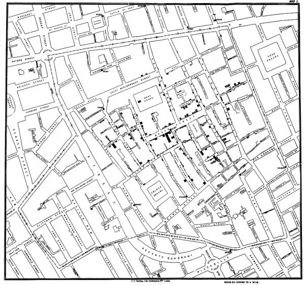 **John Snow’s map of the cholera outbreak in Soho in 1854. | Wikimedia Commons/John Snow
He went all over Soho, recording every death and talking to neighbors. He went on accumulating data, and he eventually displayed it on a map of the area, where the 13 sources from which residents drank were also marked. Every death in a home was marked with a block, and the largest number of bars was clearly clustered around the Broad Steet source.
For Snow, it was obvious: the problem was in the water. Samples were collected from the source for microscopic observation, but at that time, he couldn’t demonstrate the risk in what was seen there. Still, the pattern of contagion was clear. The source was cut off, and the outbreak immediately subsided in Soho.
In the years that followed, the experiment was repeated, and the origin of London’s water supplies was closely monitored. Treatment for the population’s drinking water was not part of any city’s public health policies; therein seemed to lie the problem. But that’s another story, one we’ve already talked about.
John Snow died of a heart attack in 1858, at the age of 45. Two years later, Louis Pasteur would publish the results of the first experiment that showed that microbes did not appear by spontaneous generation, but that they instead grew, reproduced, and spread like all other living beings.
The germ theory of disease was well underway, and, along with data from John Snow’s map, the way we understand and face disease had changed.


There are no comments yet